 Last modified:
Sunday, 06-Aug-2017 22:15:54 UTC. Maintained by: Elisa E. Beshero-Bondar
(eeb4 at psu.edu). Powered by firebellies. Last modified:
Sunday, 06-Aug-2017 22:15:54 UTC. Maintained by: Elisa E. Beshero-Bondar
(eeb4 at psu.edu). Powered by firebellies.
Last modified:
Sunday, 06-Aug-2017 22:15:54 UTC. Maintained by: Elisa E. Beshero-Bondar
(eeb4 at psu.edu). Powered by firebellies. Last modified:
Sunday, 06-Aug-2017 22:15:54 UTC. Maintained by: Elisa E. Beshero-Bondar
(eeb4 at psu.edu). Powered by firebellies.
If you completed Part 1 of this assignment, you have prepared a TSV file, and made sure you could import it into the network analysis software Cytoscape. In Part 2, we will work with TSV data that you import into Cytoscape. As you explore what you can do with graphing your network, we encourage you to return to your XQuery and output more data to provide more information on your nodes and edges. You can import this data as node attribute and edge attribute columns, and use the information in these columns to map distinctions like node size, shape, and color, as well as edge thickness (or weight
) and color. For our sample files in this exercise we will continue to work with networking character names from the Decameron project, and you should continue to work with your own extracted data from whatever project you are working on. Your design decisions need not (and probably should not) mirror ours, which are just providing as guiding examples to help you understand key concepts and how to work in Cytoscape.
After completing part 1 of this exercise, we produced a TSV file containing four columns of data pulled from the Decameron project:
Stratilia	frame	45	Pampinea
Stratilia	frame	45	Fiammetta
Stratilia	frame	45	Filomena
Stratilia	frame	45	Emilia
Stratilia	frame	45	Lauretta
Stratilia	frame	45	Neifile
Stratilia	frame	45	Filostrato
Stratilia	frame	45	Dioneo
Stratilia	frame	45	Parmeno
Stratilia	frame	45	Sirisco
Stratilia	frame	45	Tindaro
Stratilia	frame	45	Misia
Stratilia	frame	45	Licisca
Stratilia	frame	45	Chimera
Bergamino	floatingFrame	2	Filostrato
Bergamino	floatingFrame	2	Lauretta
Martellino	floatingFrame	4	Filostrato
Martellino	floatingFrame	4	Neifile
Marchese	novella	18	Martellino
Marchese	novella	18	Agolanti
Agolanti	novella	29	Martellino
Agolanti	novella	29	Marchese
Agolanti	novella	29	Pampinea
Agolanti	novella	29	Filostrato
As before in part 1, we are showing you a portion of a much larger TSV file that represents co-occurrence network data, that is, it shows individual characters from The Decameron who are connected with each other by being present in the same portion of the text, whether in the introduction or concluding frame
portions of each day of storytelling, the floatingFrame
sections in which the frame narrators provide commentary inside the story sections, and the stories themselves in the story or novella
level. These characters appear together in the same locations in the text, and this is a typical co-occurrence relationship for network analysis, which connects nodes (the characters, here) and edges (what they share or what location host them both, whether that is inside a <floatingText> or <div type="novella"> here). For more on networks of co-occurrence see our Introduction to Network Analysis and Cytoscape for XML Coders.
The difference between this TSV and the one we showed you in Part 1 is that we've added one more column, just to the right of the Shared Interaction (edge) column: to output a number. That number represents the count() of all the times in which a particular Target Node appears in a given Shared location with a Source Node. We output this number because we took distinct-values() of our source and target nodes, indicating only whether a particular character turns up with another character in a place. Adding the count() is a convenient and human-readable way to store that additional information, and it provides information we can use in weighting our edge connections: How many times did a Shared Interaction occur in the frame
, floatingFrame
, or novella
locations? We will import that numerical count into Cytoscape as an Edge Attribute.
My tutorial instructions on data import of TSV into Cytoscape are attuned to the version of Cytoscape installed in the Pitt campus computer labs, but on your own computer you will likely have installed a version on which the import screen looks a little different. On the import screen in the new version, find your way to Advanced Options
and select the Delimiter character you are using to separate your columns (a TAB character if you produced a TSV) and be sure the other characters are not selected. Deselect (uncheck) the box next to Use first line as column names.
Start Import Row should be set at 1
. Your import screen should now look something like this:
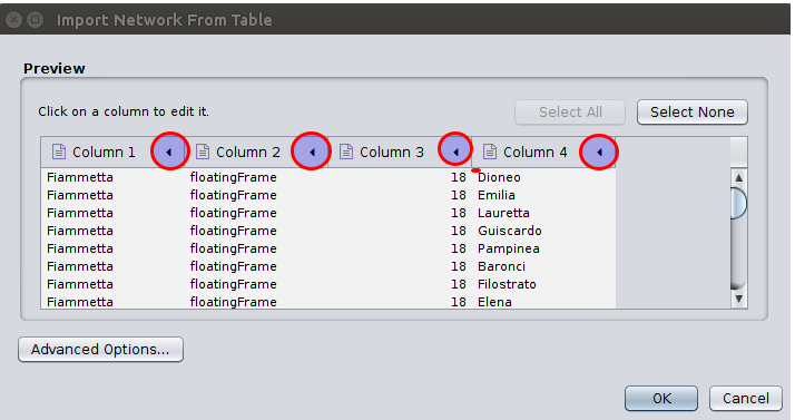
Here we see four columns to import, including our column of numbers that we will import as an Edge Attribute
. You now need to edit each column to designate what it contains, and on the graphic above I have circled where you need to click to edit the column types. (You can change this setting as long as you stay on the import screen, before you click OK
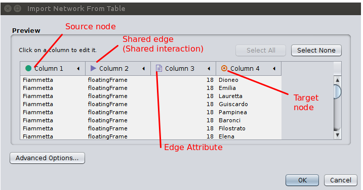
.) Identify the Source node, the Shared Interaction (or Edge), the Target node, and any Attribute columns you have created to describe Edges or Nodes. In our example, our Column 1 = Source node, Column 2 = Shared Interaction (edge), Column 3 = Edge Attribute, and Column 4 = Target Node. (Your input format is determined by your XQuery script and the order in which you output your TSV.) Here is the view of the import screen with our columns identified:
Note: If you want to modify your import later, you may want to scrap your first network and start over, if your import of Source node, Target node, and Share Edge alters (so that you add more or less lines of data, etc). If you are simply adding new columnns of attribute data and your network columns actually do not change, you can return to the import screen within the same Cytoscape session and go to File → Import → Table → File, and open your new TSV file. You will see a similar import screen, and you will want to make the same settings adjustments to in Advanced Options
. The import screen this time will have one column highlighted as a Key
, to identify with a column in your already-imported network table. You can then select which new columns you want to import, and designate them as Node Attributes or Edge Attributes as appropriate.
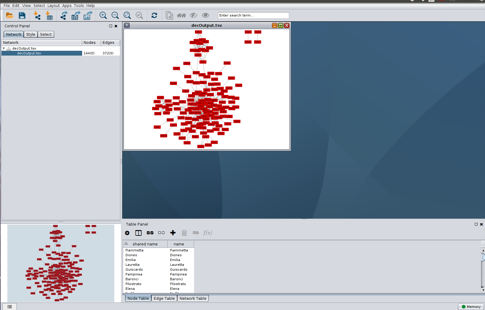
After import, Cytoscape will plot a preliminary graph for you, which may or may not be readable depending on the size and complexity of your network. Here is session view in Cytoscape after import. Notice how we now have a Table Panel view, which looks something like your TSV file. Try clicking the tabs at the bottom to view your Node Table
and Edge Table
, We will be running the Network Analyzer in Cytoscape to add some new columns to these tables next.
Cytoscape is not just a tool to make colorful diagrams by hand. It is a powerful statistical calculator, and we can use it to help us study information about our network. You want Cytoscape to read your network, so that it will then output new columns of network statistics, some of which we will discuss and work with here. One of the best ways to learn how network graphs and network statistics work is simply by plotting a network of your own project data and organizing your graphical plot based on that data. We will experiment with Cytoscape’s Network Analyzer which will give us many new column entries in the Table panel.
In the top menu bar of Cytoscape, go to Tools → Network Analyzer → Network Analysis → Analyze Network.
In the screen that comes up, we need to make an important decision: you need to indicate whether to treat the network as directed or undirected. If you are plotting a directed network, that means you have data indicating that one node has a direct relationship to another node: one common relationship in network plots is to say that one node initiated contact with the other node, or one node received something from another node. If you have data like that, you will want edge attributes indicating different kinds of relationships, and we would recommend inputting the network as directed. On the other hand, if you are following our assignment and simply looking at how your nodes occupy the same space at the same time (a network of co-occurence), you will want to treat the network as undirected. That is what we marked.
Wait a moment, and Cytoscape will produce a new window with a big collection of information, and it will populate your Node and Edge tables with many new columns, each of which represents a different network statistic. Here is our screen showing the Network Analyzer:
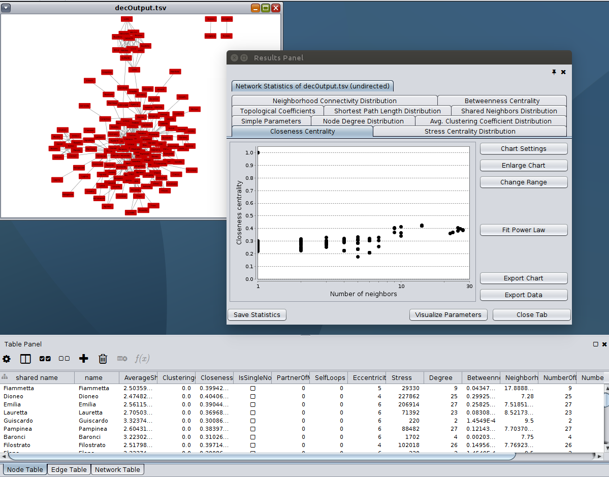
In the Results Panel, the Network Analyzer is generating its own little graphs for each network statistic! This is highly specialized information that most of us mortals do not understand, but if you click on the Visualize Parameters
button at the bottom of the Results Panel, we encourage you to explore some of the options to experiment with sizing and coloring your nodes and edges based on node Degree, for example. You will have more sophisticated options for styling your network graph in the Control Panel on the left of the Cystoscape screen.
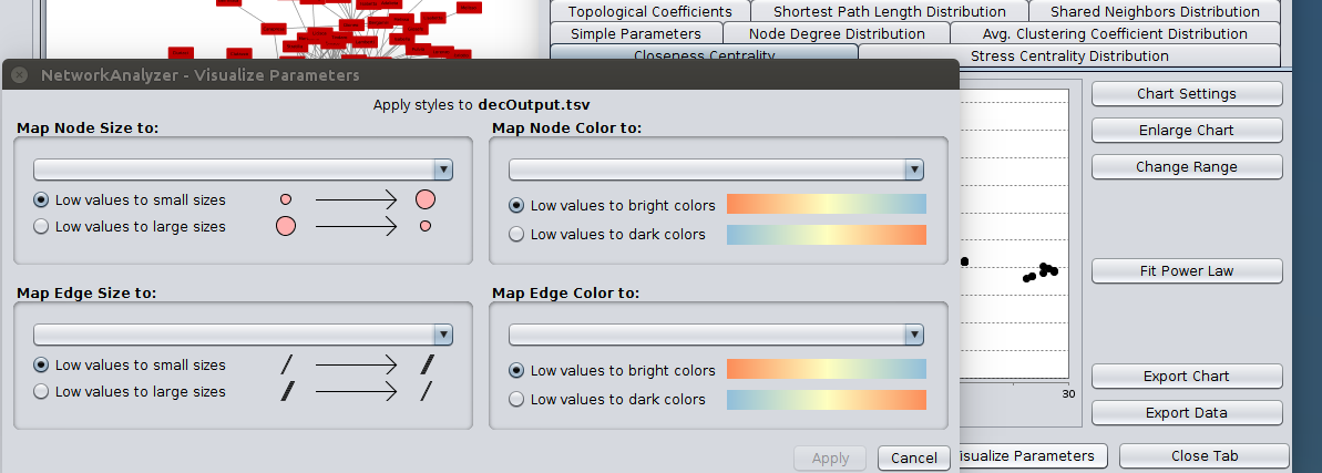
Let’s experiment with plotting your graph so that your nodes have a color that you designate, and so that anything for which you have output a column of attribute data, whether for nodes, edges, or both, are plotted with a meaningful color and size,
We can also experiment with plotting based on an arrangement of network statistical information. Follow my guidance in the Cytoscape tutorial to get started with these things, and try plotting a graph organized by Degree and by Average Shortest Path Length. We will discuss these concepts in class and they are also discussed in the tutorial, but you will gain a better understanding of them by visualizing your data in these formats yourself.
Save your Cytoscape session by going to File, Save as. Your file will be saved with the extension .cys. You will not be able to post this session view on a website, however! For that you will need to export a view as an SVG or a PNG, or as a Dynamic Session. For now, export an SVG by going to File → Export → Network view as graphics. On the bext screen, select SVG as your export format, browse to the location on your local computer to save the file, and then enter a filename complete with the .svg extension. You can reopen your Cytoscape session at any time after you have saved it, so if you push it to GitHub or upload it to Box, you should be able to access it on any computer running Cytoscape and keep working where you left off.
SVG and/or PNG formats. Or if you wish, provide us in your XQuery script file a link to an HTML page on which you have embedded an output Network Analysis graphic.Upload your modified XQuery script (in a text file) and your TSV file to the Courseweb upload point for this assignment, and upload your .cys Cytoscape Session file to the Homework Return folder we share with you in Pitt’s Box at http://pitt.box.com/. (We do not think you will be able to upload the .cys file to Courseweb.)